REDWHEEL - WORLDPAY - NATWEST - CASHSTORE - BARCLAYS - QATAR DEVELOPMENT BANK
RedWheel
PRINT
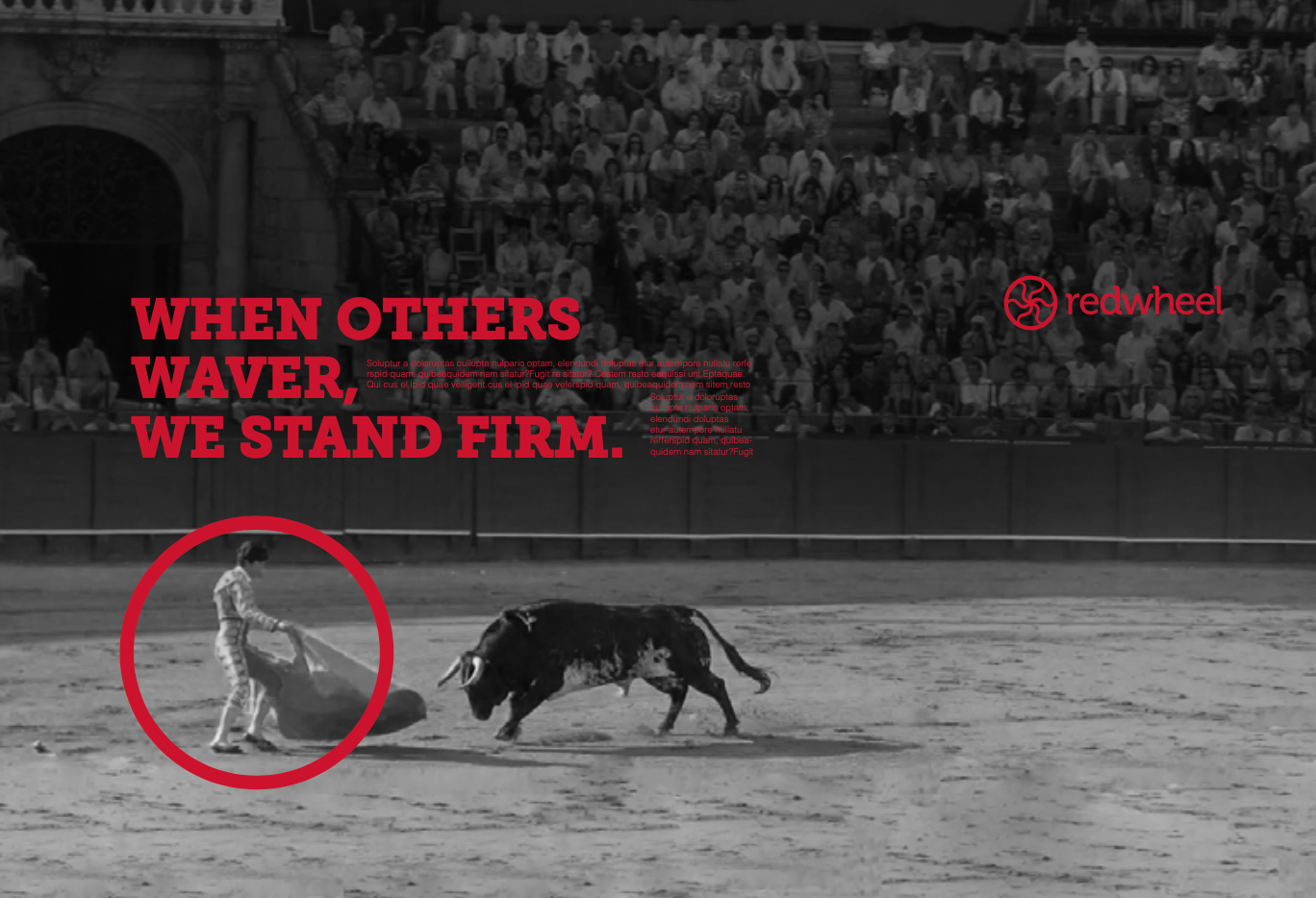
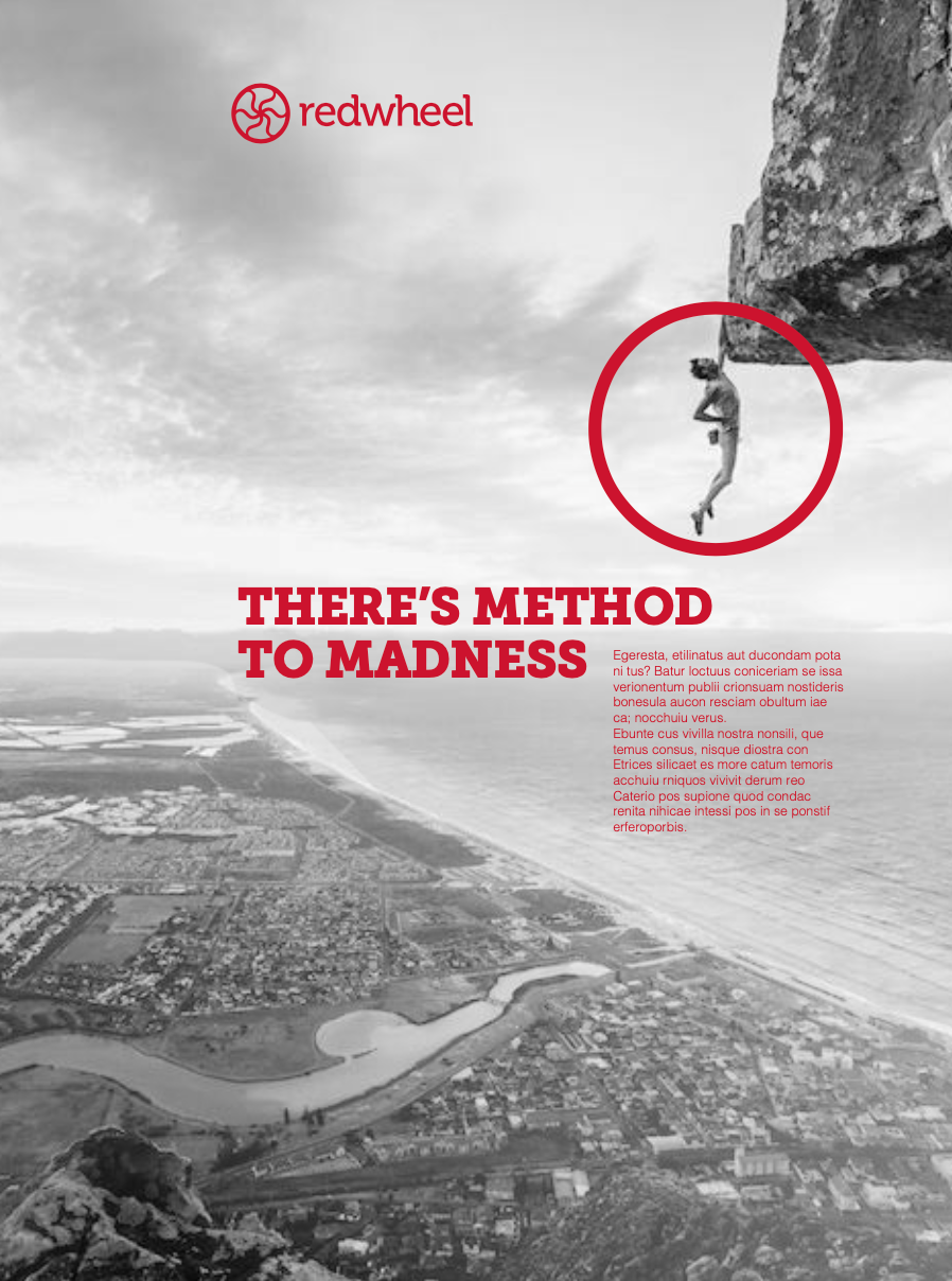
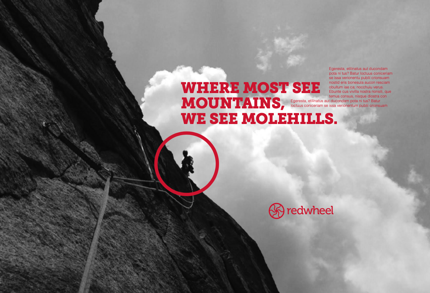
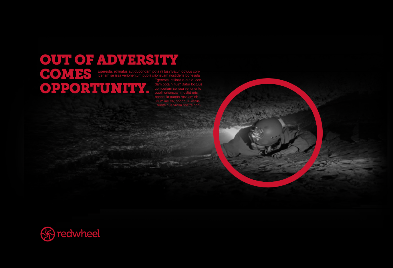
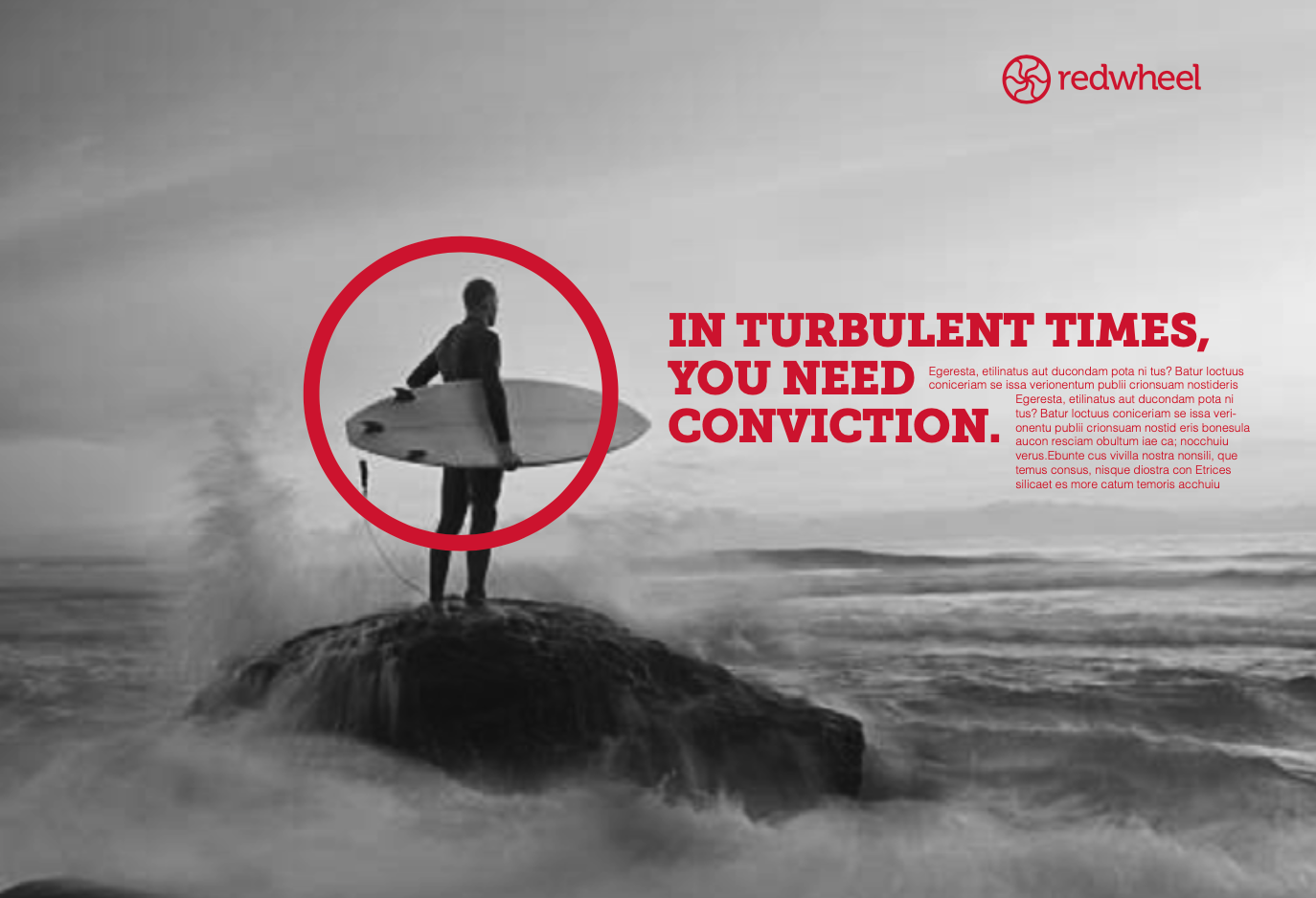
Redwheel have a different investment approach. They follow a very disciplined approach to Global Equity Income. They don’t follow the herd. They buy companies when something is going wrong. They have the patience to suffer underperformance. Their bravery stands the test of time. We took the metaphor approach of portraying this bravery in a bold and epic way.

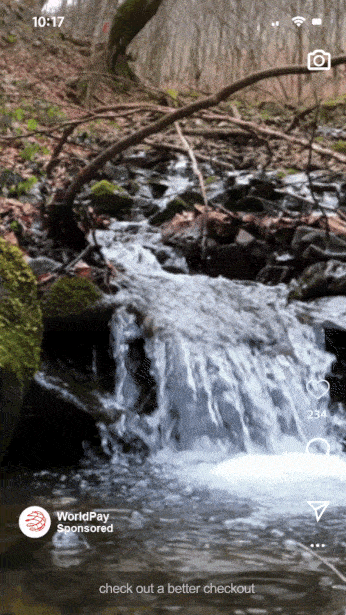
Worldpay
PRINT • CONTENT • DIGITAL
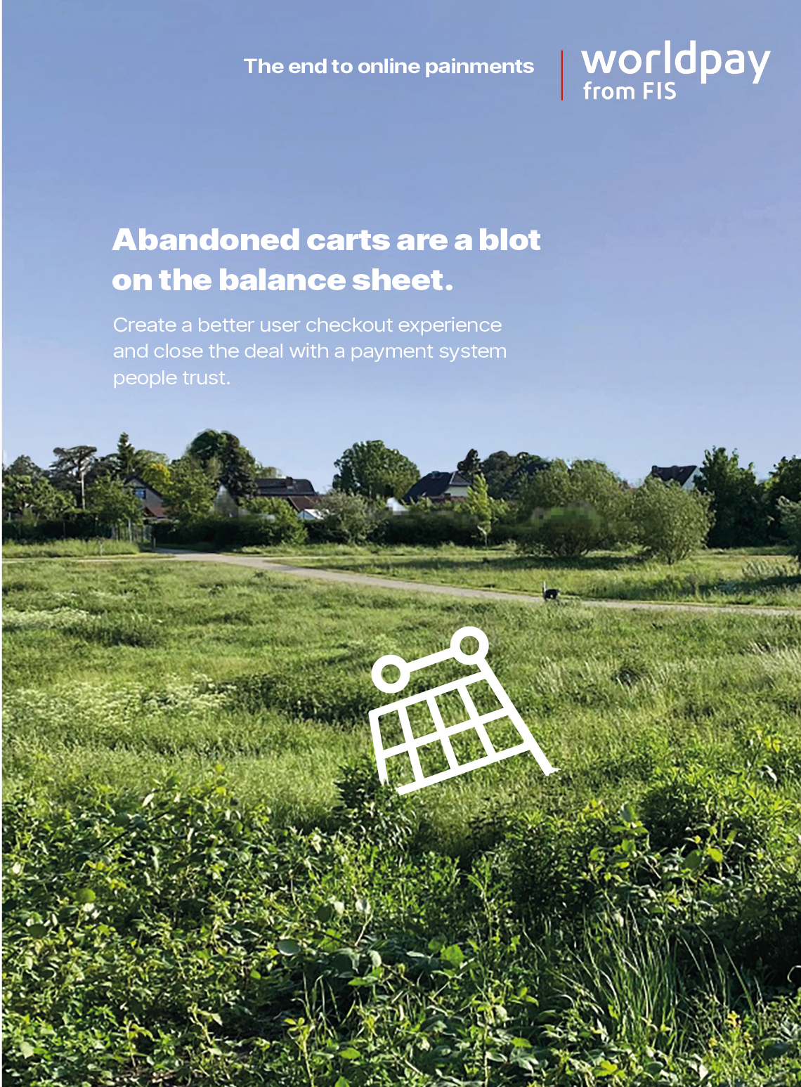
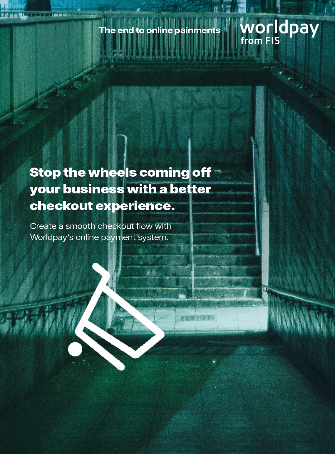
When Worldpay launched they were up against some big competitors, so they needed to say something new. So, we focussed on the widespread problem of cart abandonment. With Worldpay, customers can feel assured they’re using an uncomplicated, safe and dependable checkout service, and businesses won’t lose that vital sale at the last hurdle.


Natwest
TV
Natwest wanted to stand out in the banking world.
They were falling behind their competitors. They wanted to feel fresh and modern. We were asked to create an individual style for each of their financial products to make them distinguishable. The look also had to be able to carry through to the rest of the in-branch collateral.
They were falling behind their competitors. They wanted to feel fresh and modern. We were asked to create an individual style for each of their financial products to make them distinguishable. The look also had to be able to carry through to the rest of the in-branch collateral.
This work earned a Silver at The BTA and The Creative Circle awards.
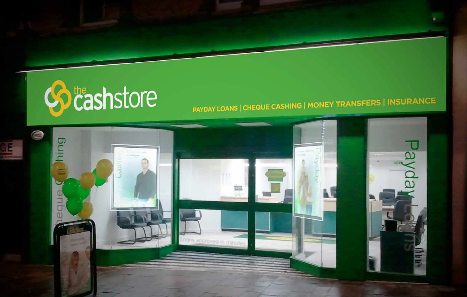
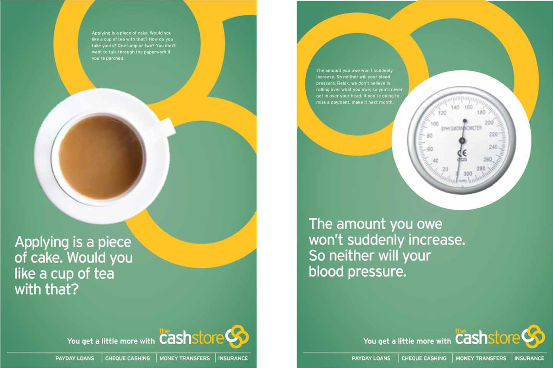
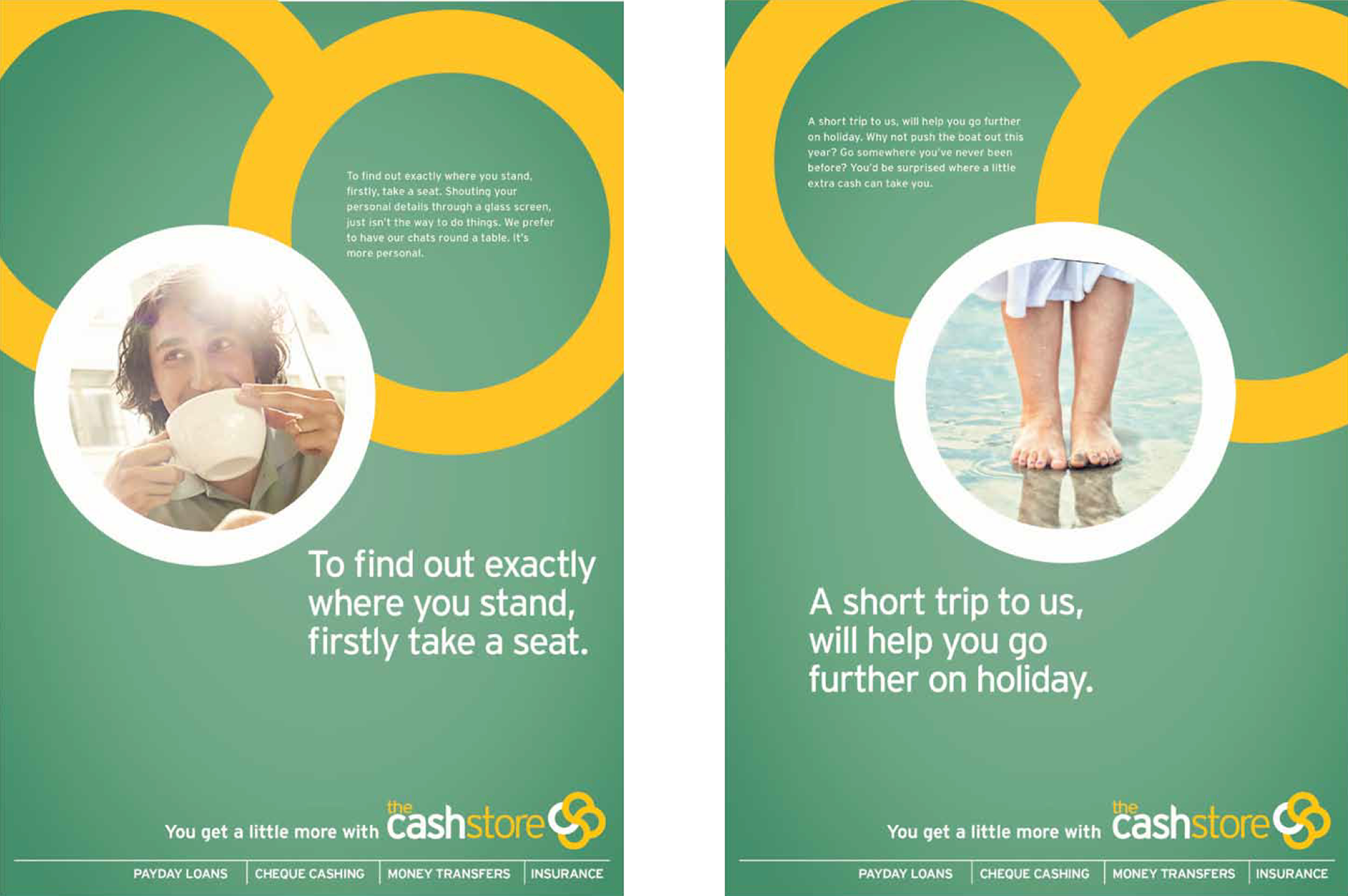
Cashstore
REBRAND • PRINT
The Canadian loan company wanted to expand its stores across the UK. Before this growth they needed a strong brand.
We redesigned their logo and created a bold look for their print campaign, which highlighted their key benefits in a more open, honest tone of voice. We won the pitch.
We redesigned their logo and created a bold look for their print campaign, which highlighted their key benefits in a more open, honest tone of voice. We won the pitch.
Barclays
EDM • DM
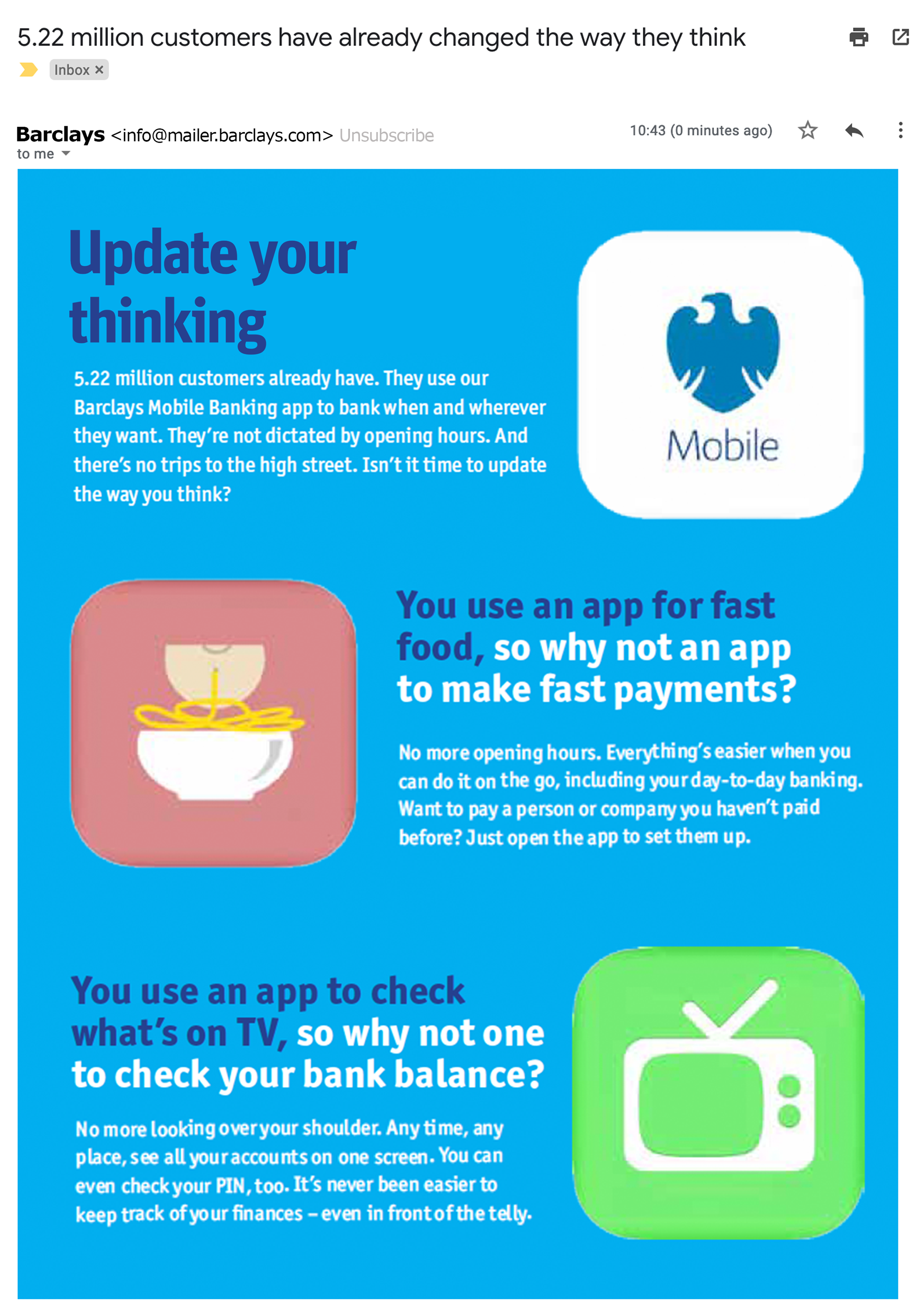
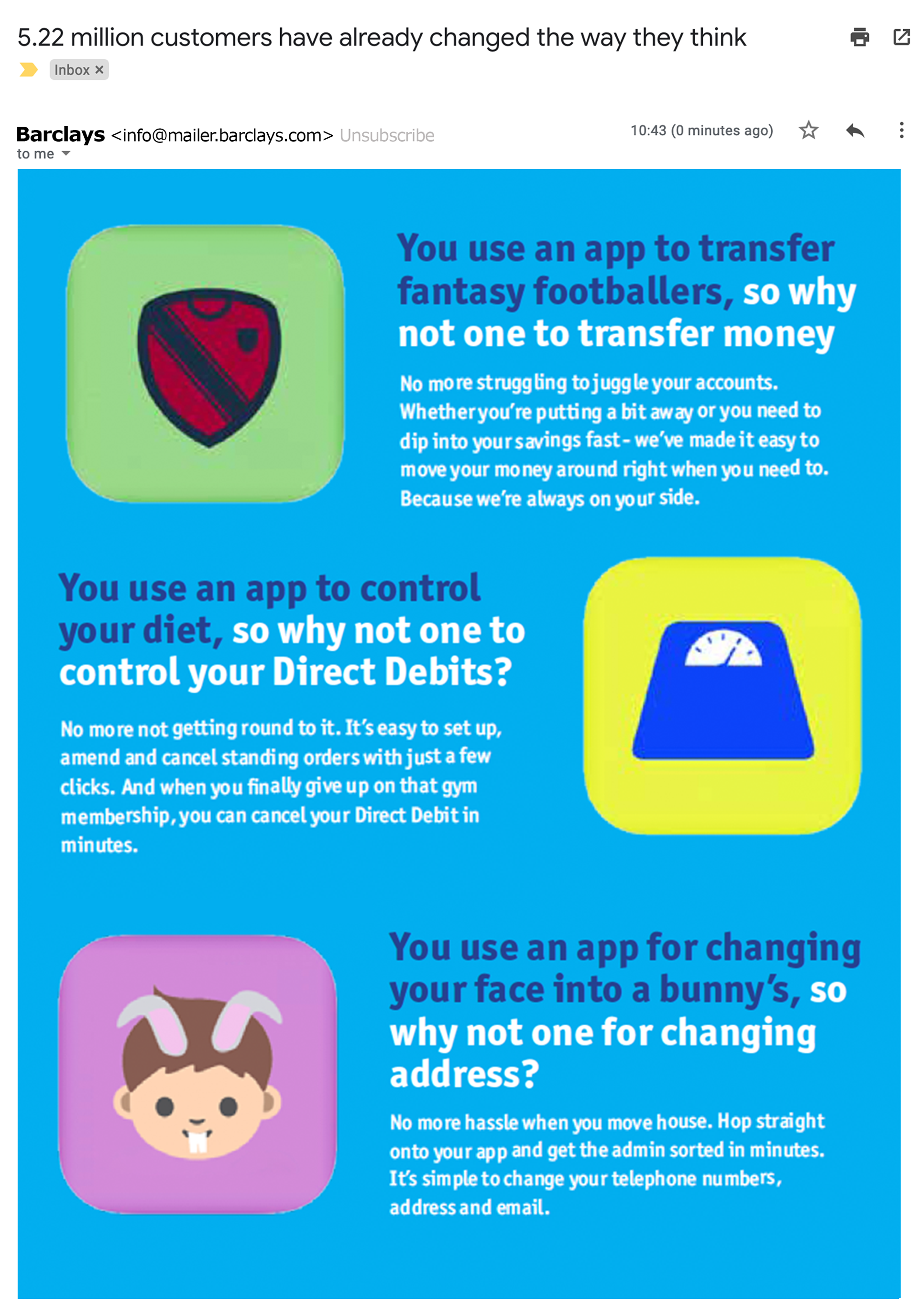
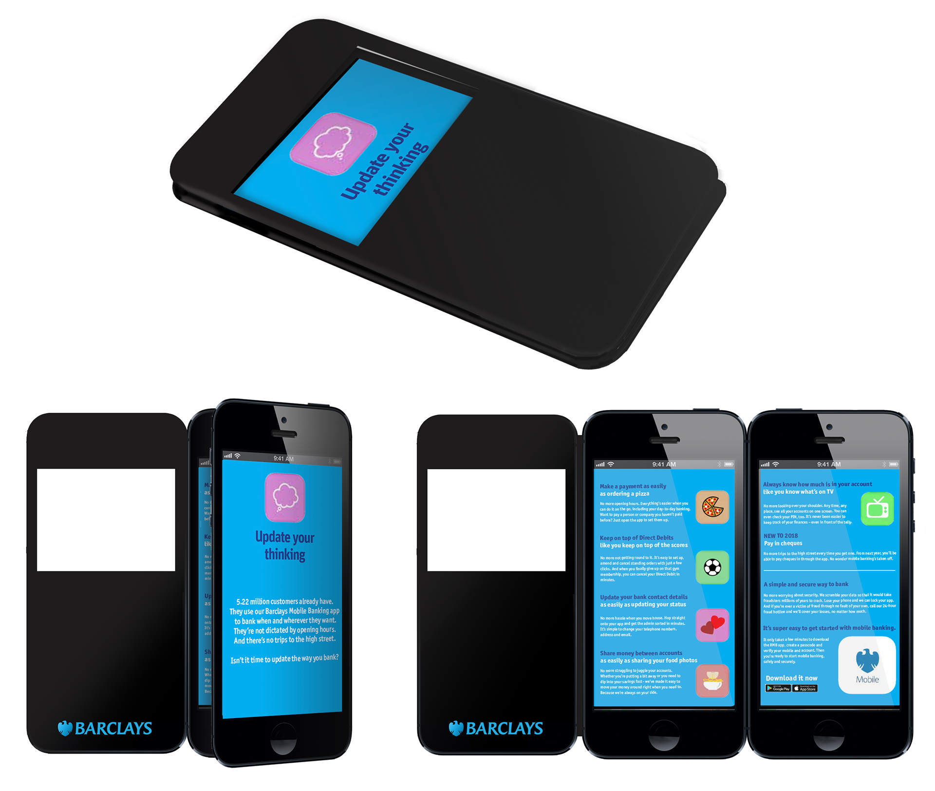
We were asked to help encourage more Barclays customers to use their mobile banking app. We saw an opportunity in highlighting that we're happy to do everything else in our lives via an app, so why not banking?
Qatar Development bank
PRINT • SOCIAL
We were asked to create an idea that showed the support the bank gives to the forward thinking entrepreneurs of Qatar. The campaign needed to cover two categories - home grown businesses, and export.

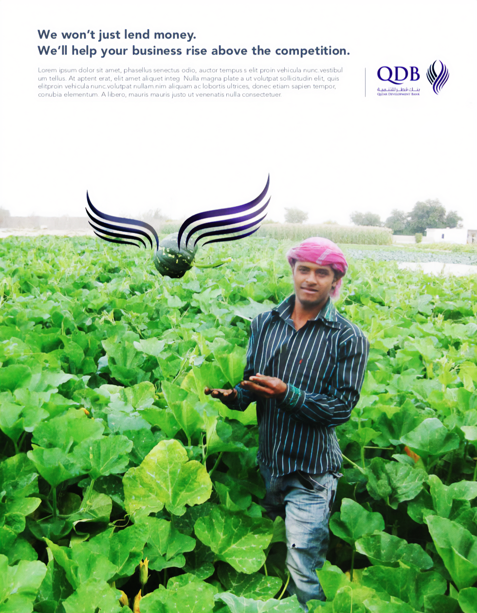
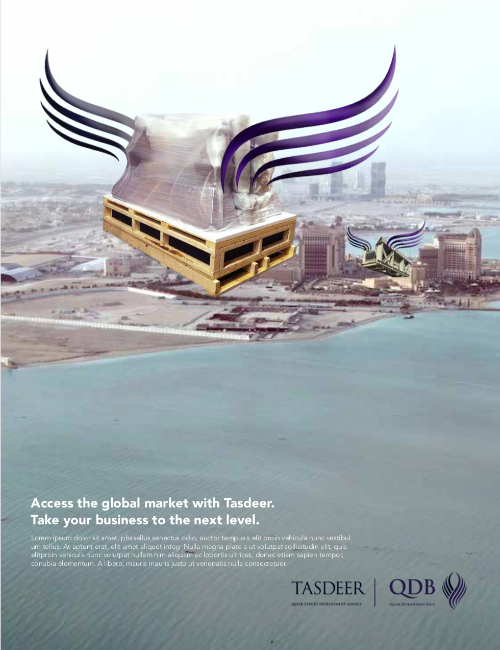

Animated 'wings' carry the pen through the business journey, thus representing the bank's support throughout.